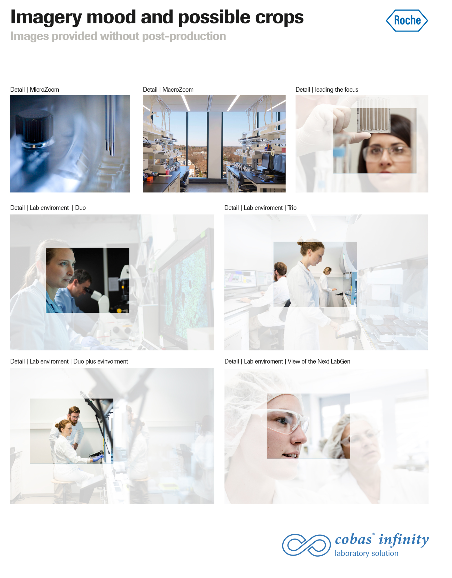
Imagery and Mood research and proposal.
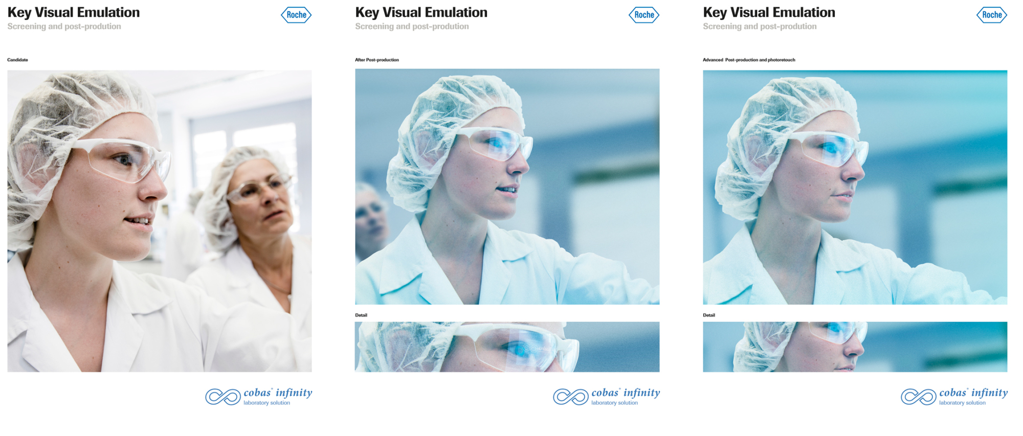
Key Visual research, before & after display.
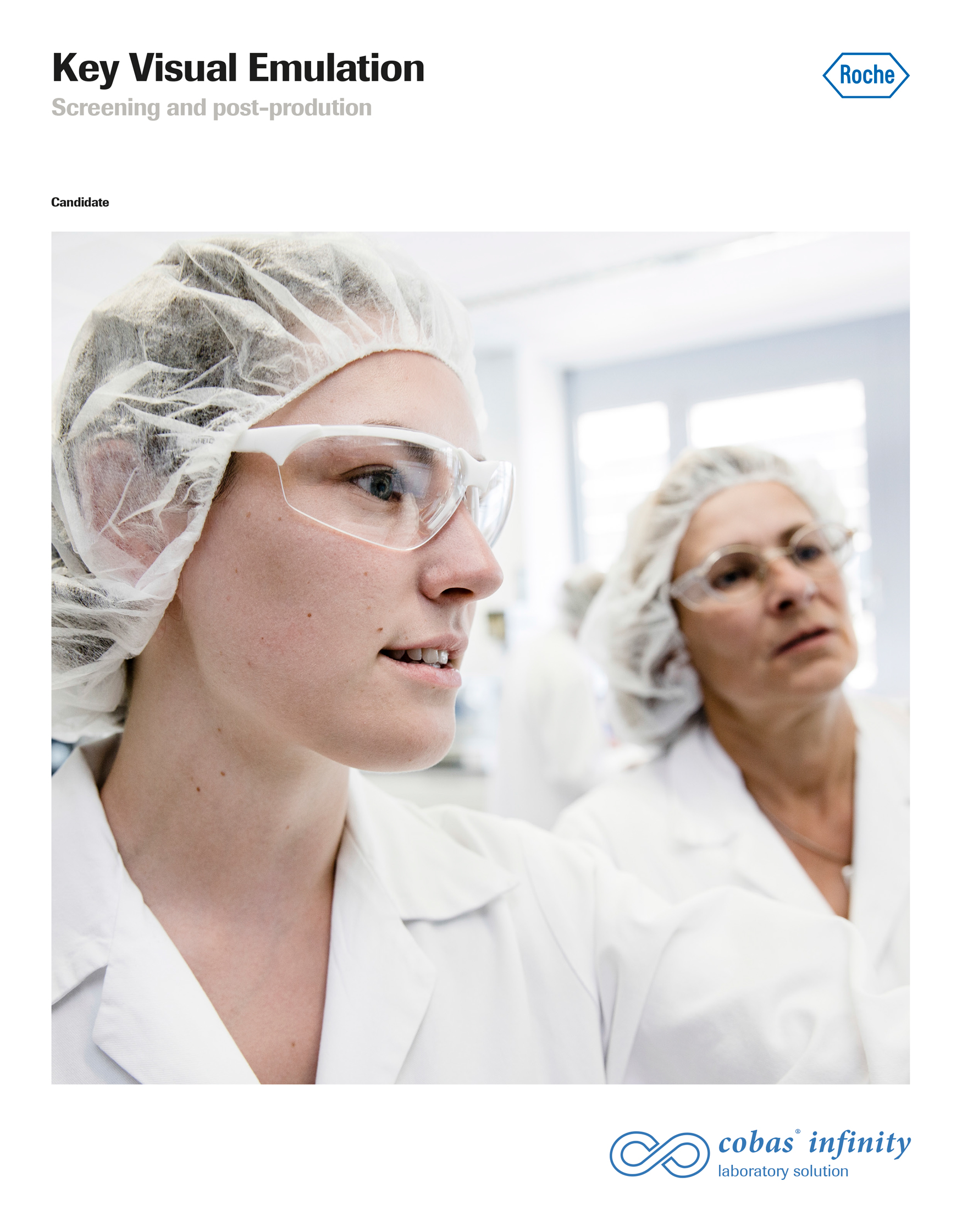
Native Key Visual.
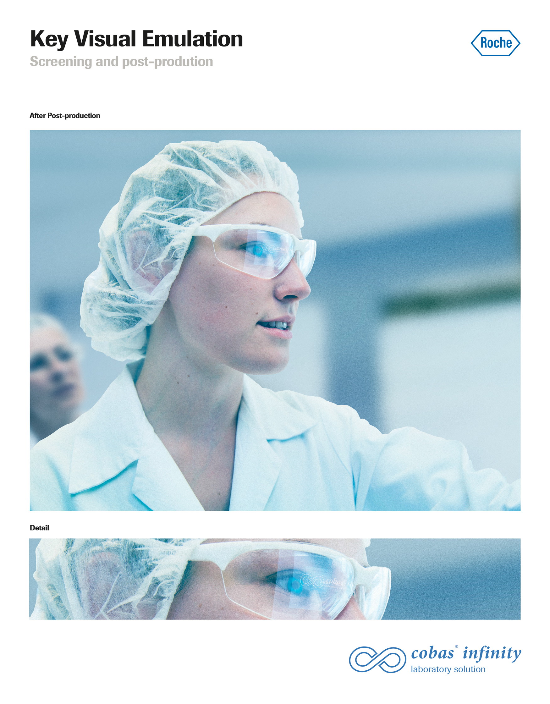
Finalised Key Visual, with crop.
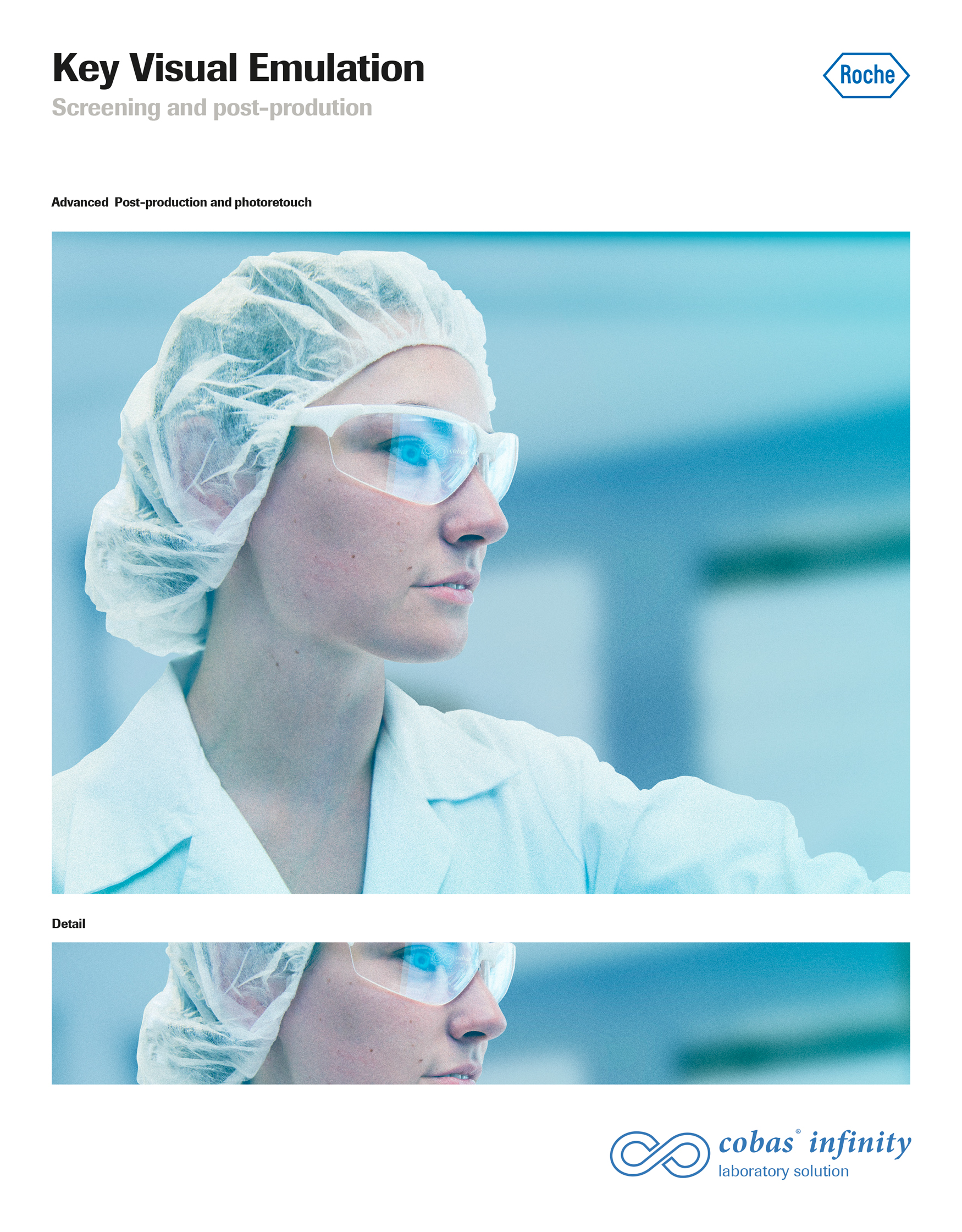
Advanced Key Visual photo-retouch, with crop.
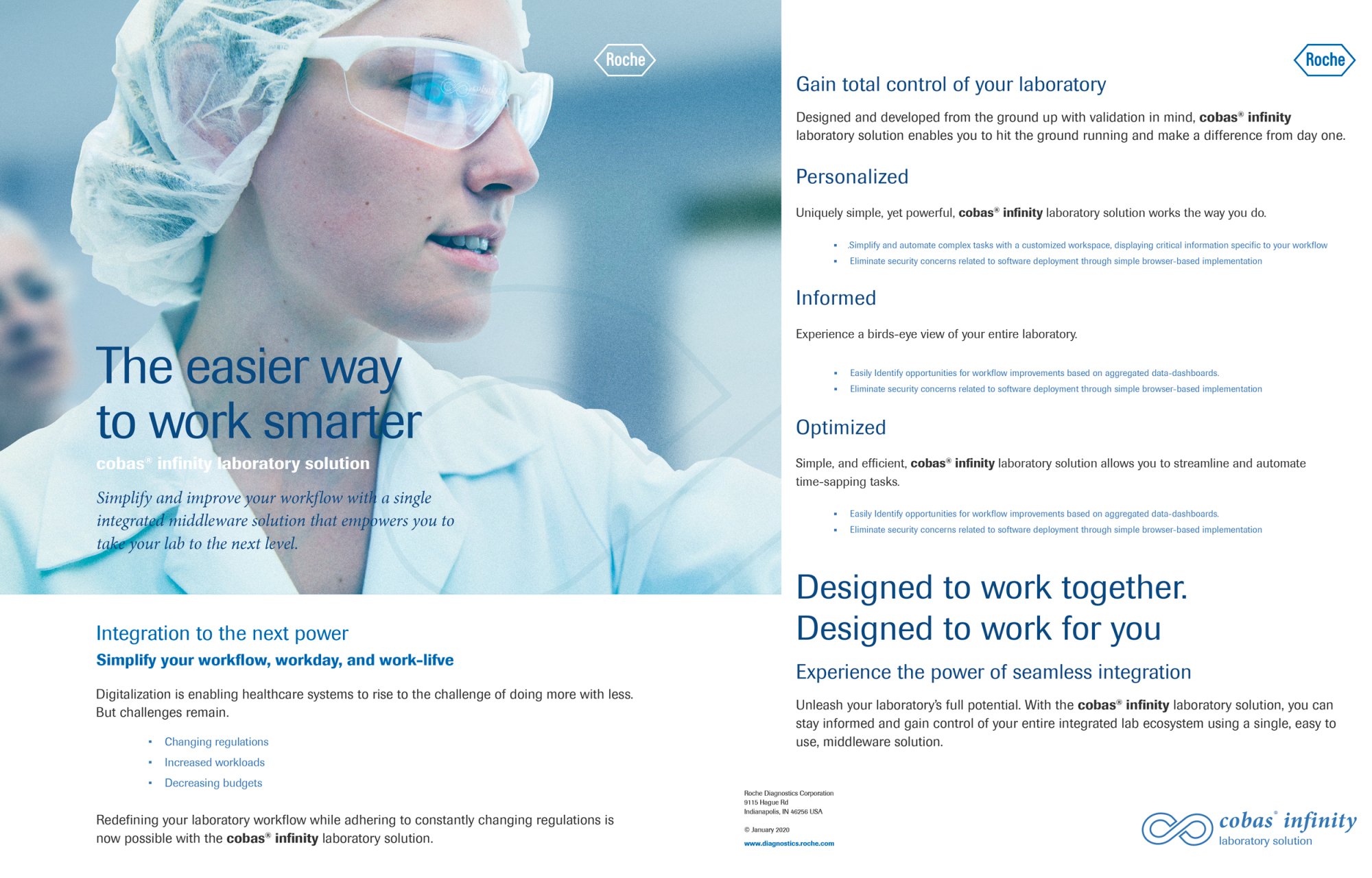
Finalized Layout for CL.
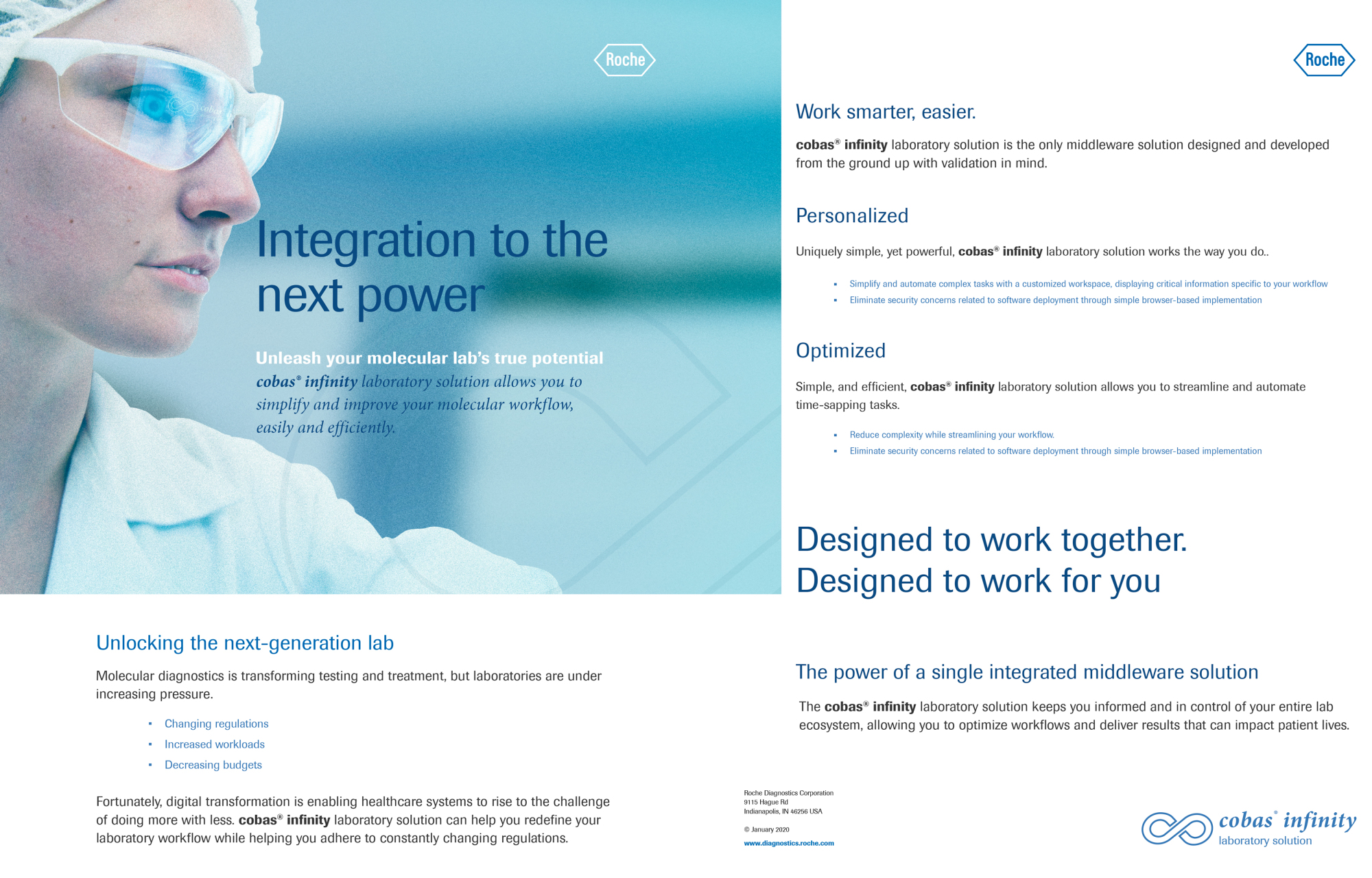
Finalized Layout for MD.