Key Visual, naked without claim

Brochure Cover.
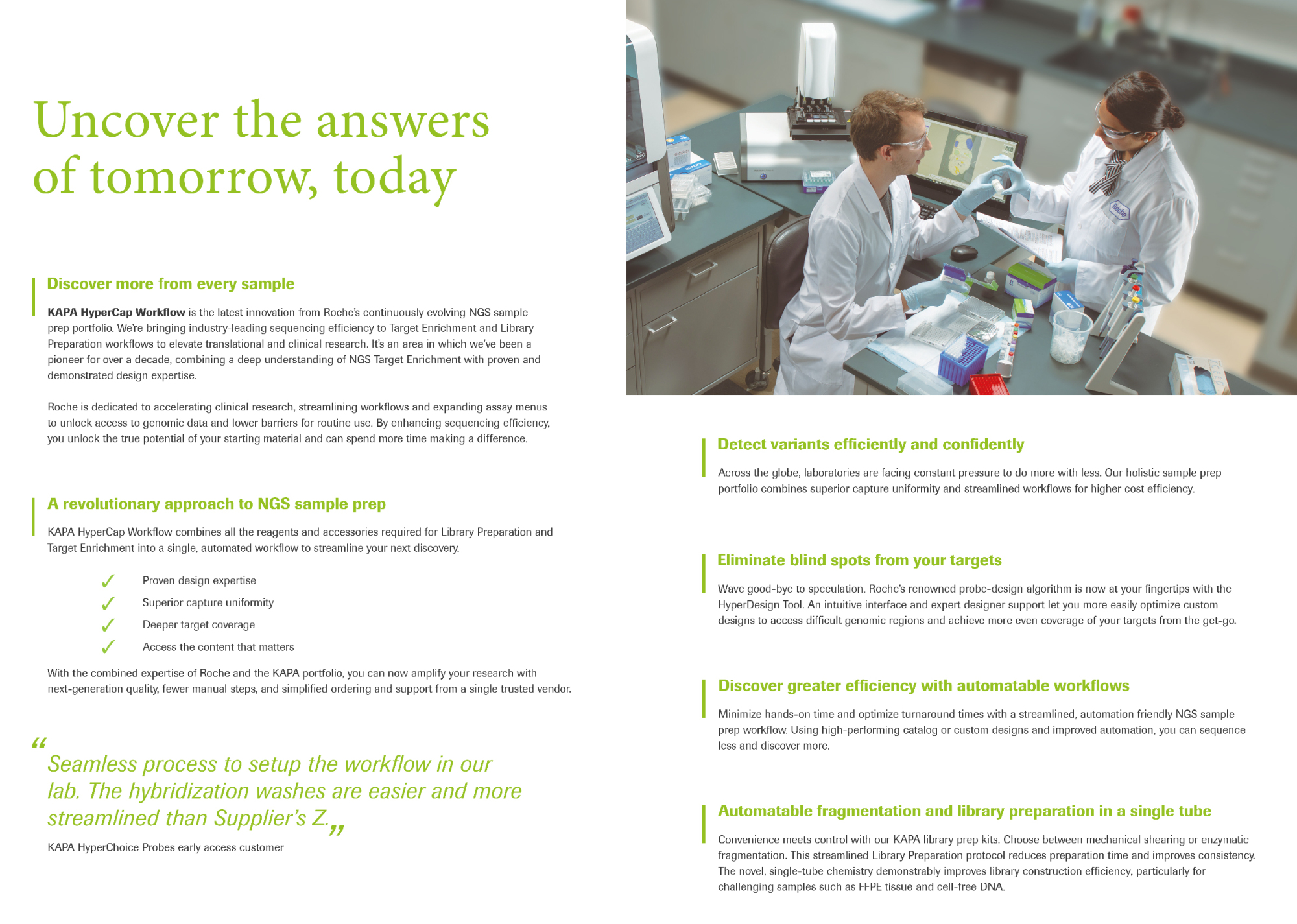
First and Second internal page.
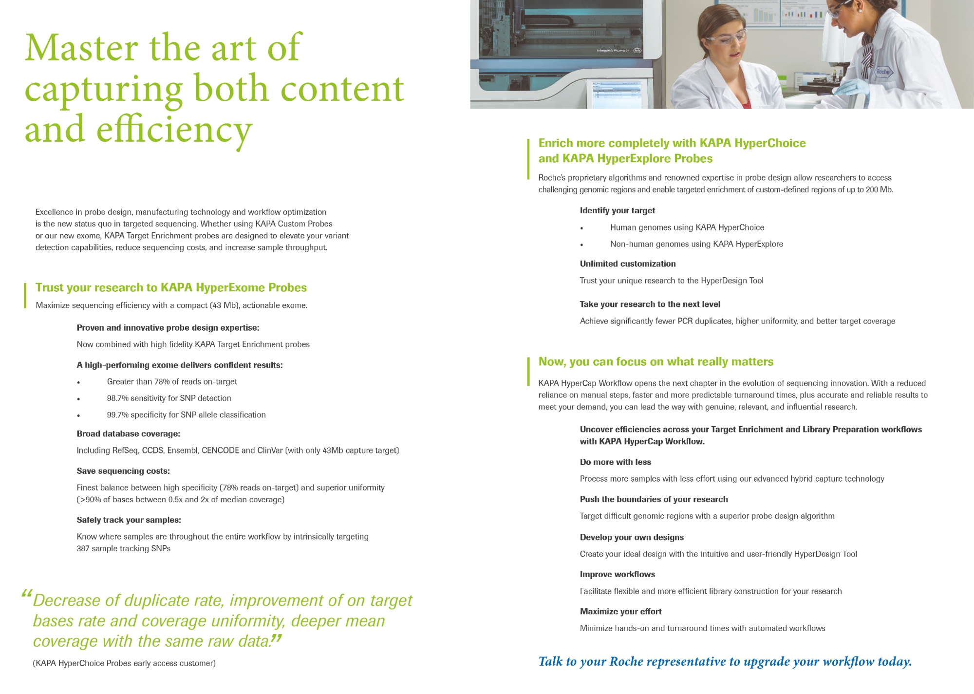
Third plus Last Page.