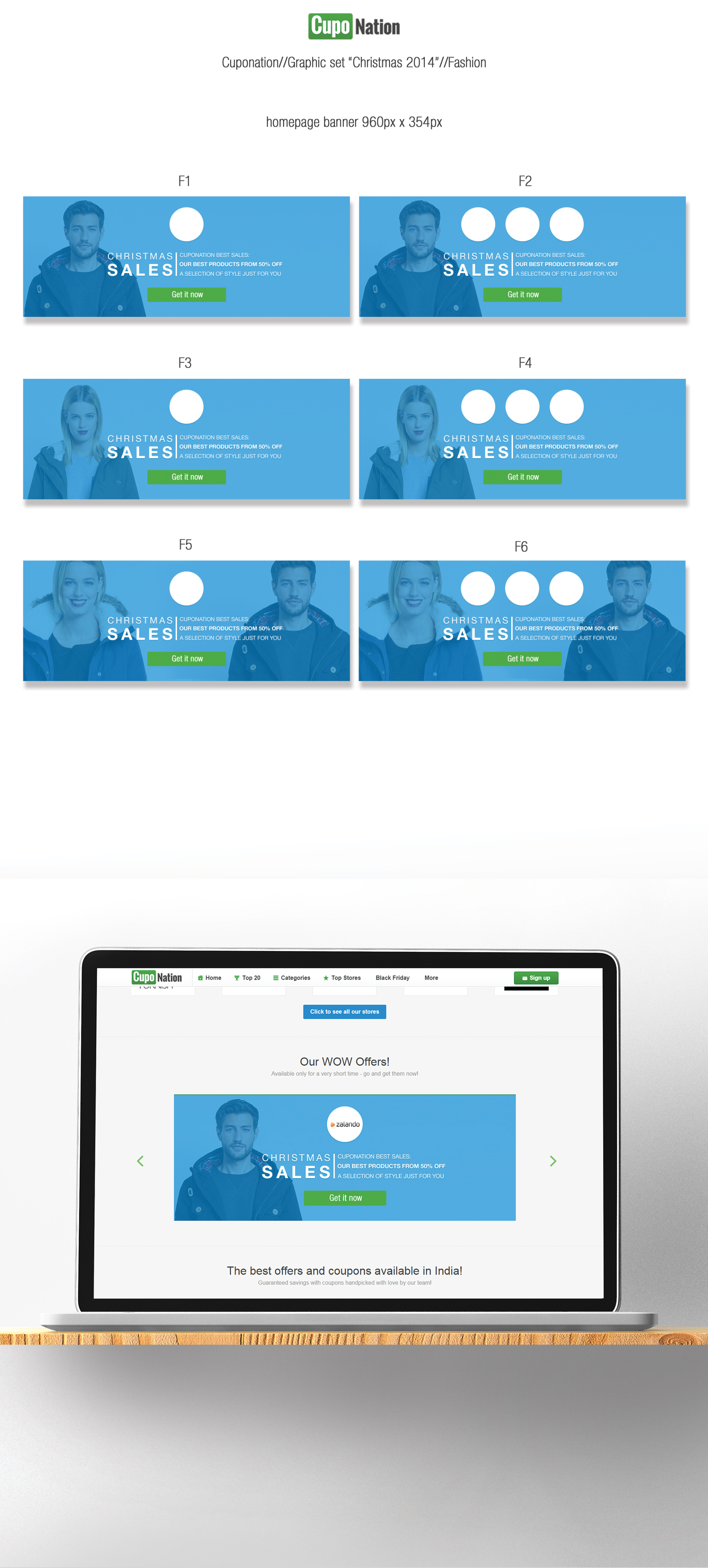
Unfortunately, advertisement on websites suffer about a well known issue called banner blindness: in order to overcome tunnel vision and deficit of attention in banner design and amplify the content marketing, the design I introduced generate direct focus on the display advertisement by following Native Advertisement solutions. The Font and its Class is as well, within the content side,one of the most important elements in a banner design. After a choosing the proper Font thought a/b testing and case studies, I set up rules in matter of maximum length and character displayed for the h1,h2 and call to action, in order to assure a correct and clear Readability.
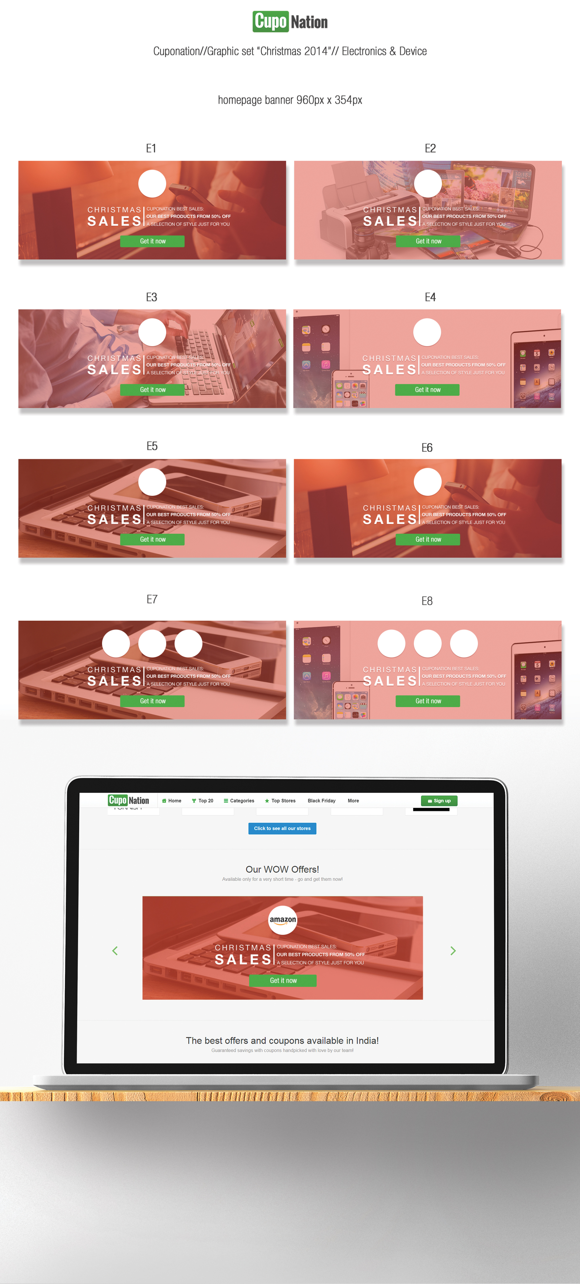
Workflow: Quality doesn't mean loss of time, psd architecture for a correct operating speed. Give the right design solution in the shorter time possible is essential, especially during sales period. Every graphic department tested the stress during those times, and being surrounded by thousand request from different clients doesn't make to work easy. That's why the architecture of the psd files is absolutely crucial: in this Project each catalogue is composed by different banners for each business solution. All the banners are not flat images but smart objects, well cropped and fixed into a matrix (in order to avoid display errors). So, in by clicking in each banner is possible to find other graphical solution within the client request. Call to action Button is as well converted in smart objects, by clicking on them is possible to select the right language the designer wanted to display.